The story behind my
personal branding
My own personal brand has been something which I have toyed with on and off since I was in my second year of college. Because my name does not exactly roll off the tongue, I initially started branding through the idea of a monogram with the initials “S” & '“P”. While I actually liked the results from this, it was not achieving what I wanted it to do. While the monogram was indeed legible and recognisable, it was not telling the viewer what or who I was. I was left with only one option, and that was to use my name.
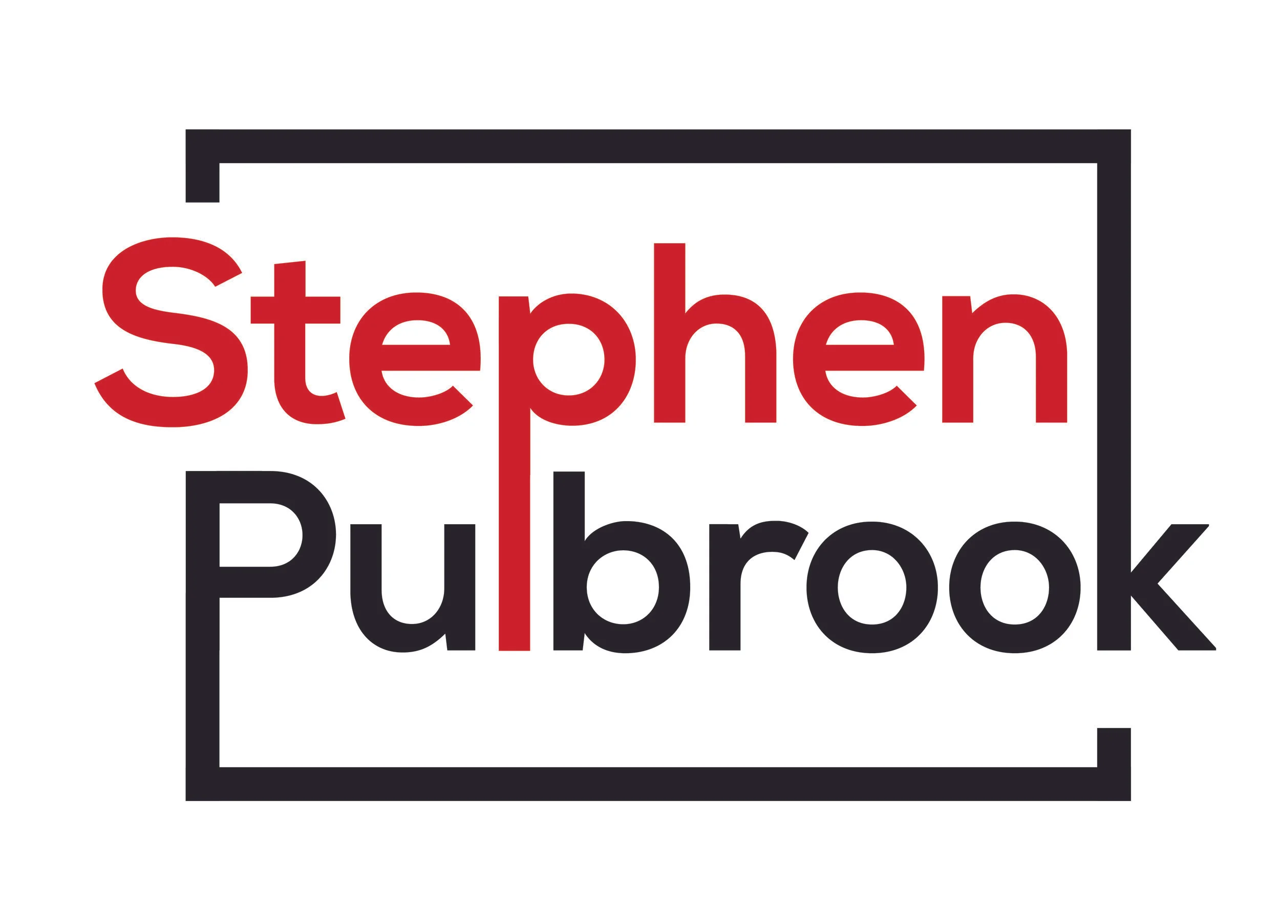
As a creative, I liked the idea of thinking outside the box. In addition to this dynamic design is something which I have always preferred as opposed to a flat or one dimensional design. In line with both of these concepts, I eventually arrived at this logomark, which incorporates both the idea of being outside the bounding box of the border, and also the dynamic movement created by the intertwining of the letters “P” and “L”.
In accordance with this dynamic and modern feel which I wanted to achieve, I chose red and black as a colour scheme, and nexa bold as a base modern, clean typeface.
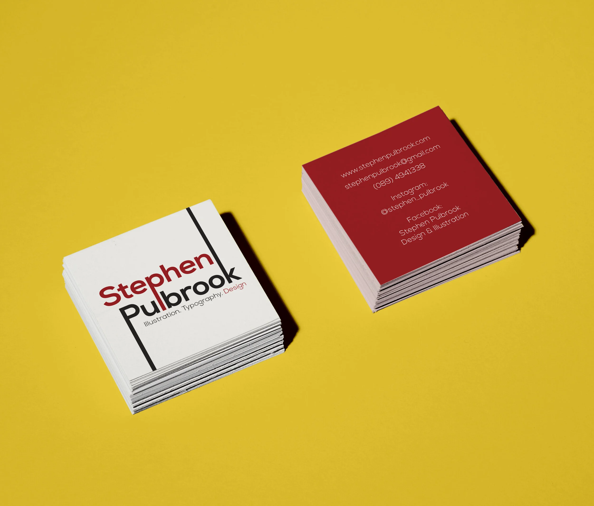
For my business cards, I decided to lose the bounding box in my usual logo and instead allow the ascender and descender to flow naturally off the sides of the card. Along with this I added the tagline “Illustration. Typography. Design” Three little words that sum up everything that I do. On the flip-side all of my contact details are set against a red background which ties the whole design together with my branding colours
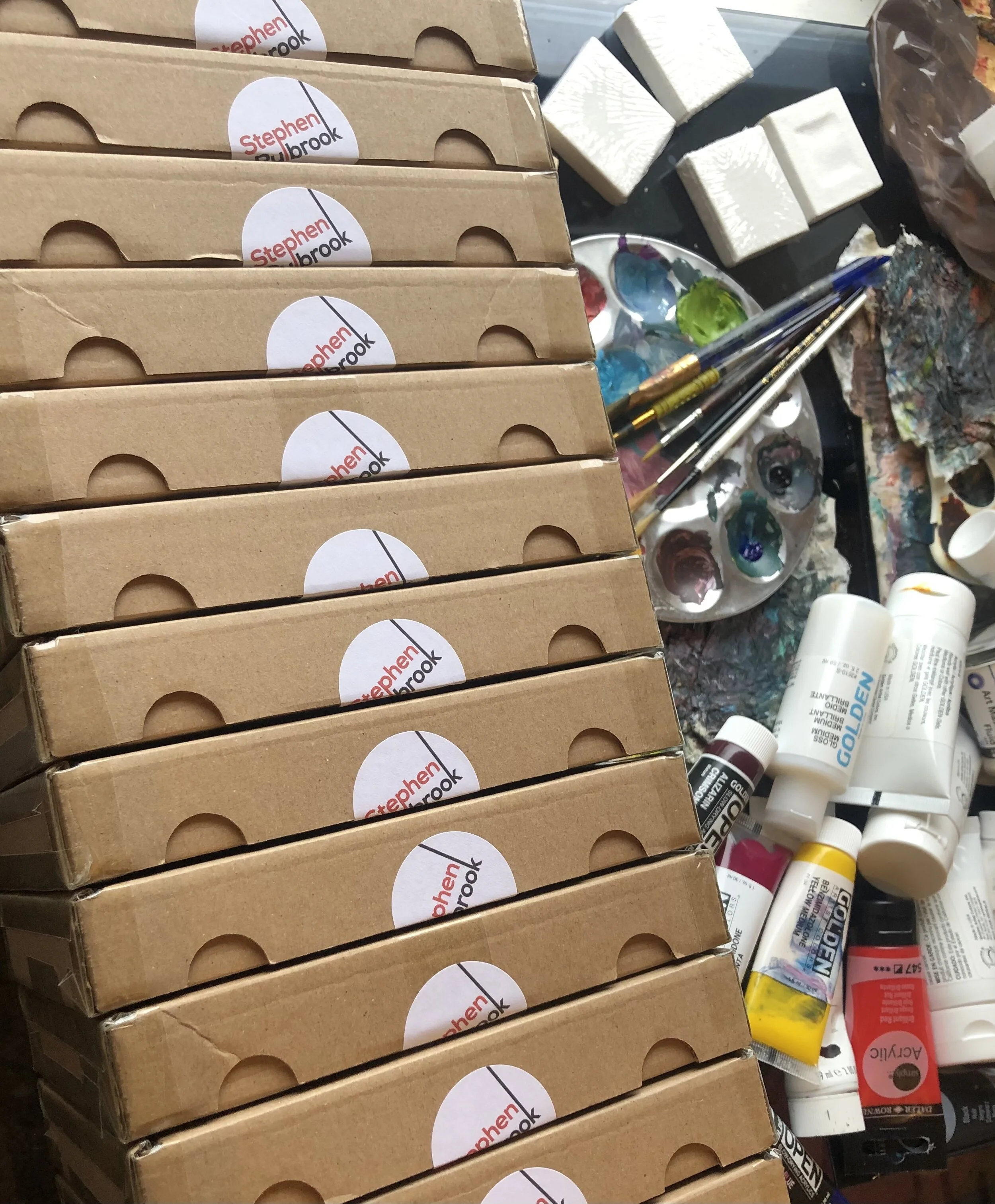
An example of stickers used to seal boxed orders.
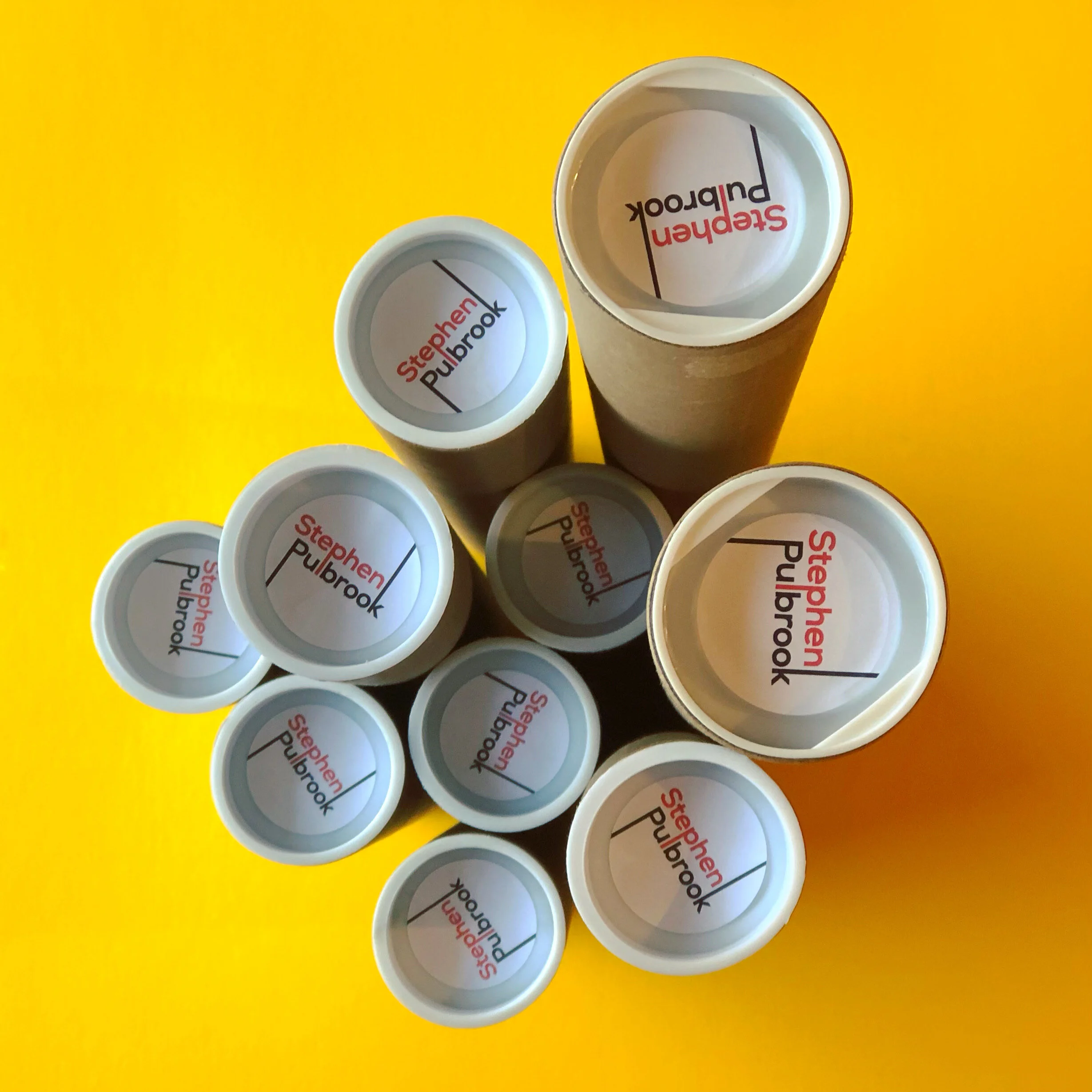
Along with the usual business cards, I use stickers with all of my orders in order to seal everything and create a consistent brand identity. It’s little touches like this that end up making all the difference in the presentation of a product. This photo shows the placement of stickers at the end of postage tubes, used to post out prints.


